Instructions
- Identify an image (before image) that violates visual design principles regarding Color introduced in Chapter 7. Save your before onto your computer.
- Create a new file (1200 x 1800 pixels, 72 Pixel/Inch) with Adobe Photoshop.
- In the new file (after image), recreate the same information in the before image, but make each visual element comply with design principles introduced in Chapter 7.
- Upload both before and after images onto a Weebly page.
- In a paragraph (between 200 – 400 words), describe explicitly why the before image fails to comply with the visual principles and how you corrected it with your new design.
Color - Before and After
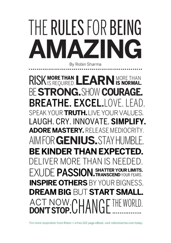
Before Image
|
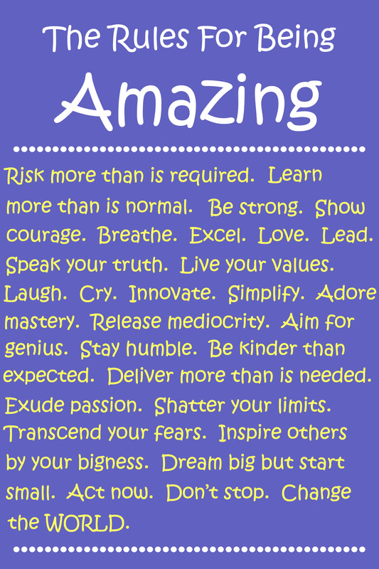
After Image
|
Rationale
This is something that I was introduced to by Dr. Ann Marie Taylor, Director of Special Education for Edgefield County. I fell in love with the "Rules" so I took the before image, which was what I found online, and put it on the wall behind my desk as a reminder of what I wanted to be each day. Well, the students in my class caught on to it and started asking a lot of questions about it. However, because of the layout and the color they either had a lot of difficulty trying to read it or just found it boring. One student actually told me it was "ugly because it didn't have anything to make it pretty." After talking with her about it I figured out that she meant the color was bland and dull. She was right. So, when this project came up I decided to make a new poster for my wall. I kept the same exact content, just added a little splash of color to liven it up. I added a blue colored background with a very small gradient from darker at top to lighter at bottom. I then kept with the classroom color theme of blue and yellow and white. I didn't go over the top with this, just made it less "ugly" so my 2nd graders could understand, read, and accept the rules that we try to live by in class.
This is something that I was introduced to by Dr. Ann Marie Taylor, Director of Special Education for Edgefield County. I fell in love with the "Rules" so I took the before image, which was what I found online, and put it on the wall behind my desk as a reminder of what I wanted to be each day. Well, the students in my class caught on to it and started asking a lot of questions about it. However, because of the layout and the color they either had a lot of difficulty trying to read it or just found it boring. One student actually told me it was "ugly because it didn't have anything to make it pretty." After talking with her about it I figured out that she meant the color was bland and dull. She was right. So, when this project came up I decided to make a new poster for my wall. I kept the same exact content, just added a little splash of color to liven it up. I added a blue colored background with a very small gradient from darker at top to lighter at bottom. I then kept with the classroom color theme of blue and yellow and white. I didn't go over the top with this, just made it less "ugly" so my 2nd graders could understand, read, and accept the rules that we try to live by in class.
