Instructions
- Identify an image (before image) that violates visual design principles regarding Visual Cue introduced in Chapter 12. Save your before onto your computer.
- Create a new file (1200 x 1800 pixels, 72 Pixel/Inch) with Adobe Photoshop.
- In the new file (after image), recreate the same information in the before image, but make each visual element comply with design principles introduced in Chapter 12.
- Upload both before and after images onto a Weebly page.
- In a paragraph (between 200 – 400 words), describe explicitly why the before image fails to comply with the visual principles and how you corrected it with your new design.
Visual Cue - Before and After
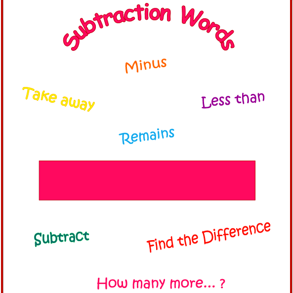
Before Image
|
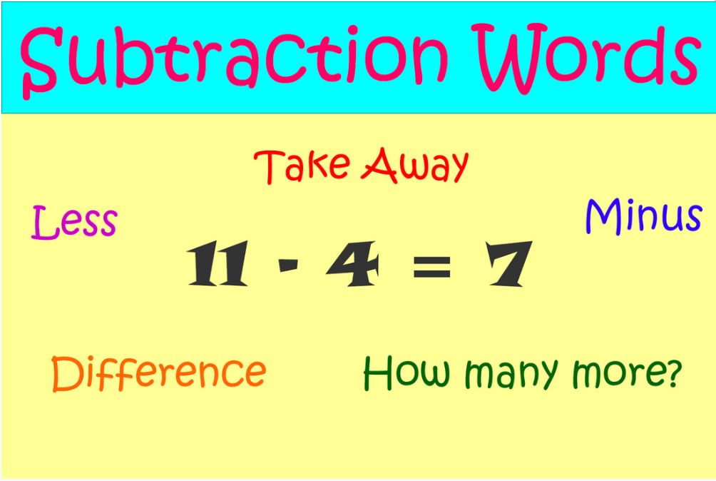
After Image
|
Rationale
I chose this image to recreate because, to me, it had good content but it was confusing as to exactly what you were looking at or trying to learn. I brought it to my children and told them we were going to play a game and that I was going to show them a picture for 3 seconds then hide it and they had to tell me what the picture was about. They felt sure they could figure it out. However, when we did the exercise, not one student of the 17 could tell me what the topic of the picture was. That is what solidified my mind about redoing the poster. I told them it was about subtraction keywords and that I wanted to redo the picture so we could use it in class. With that in mind, I did a few things to make it more visually appealing and to draw your eyes to the title and the math problem in the middle. I added a color title bar with "Subtraction Words" typed in. This draws most young students first because of the color and position on the page. I also replaced the "minus sign" in the before image with an actual subtraction problem in the after image. I did this so if a student's eyes were drawn to the problem before the color bar title, then they would quickly know this has something to do with subtraction. Another reason for adding the problem in the middle is because several of my students get "hung up" on the word subtraction and can't figure it out quickly. By having another point of reference from which to figure out the word adds to the effectiveness of the poster.
I chose this image to recreate because, to me, it had good content but it was confusing as to exactly what you were looking at or trying to learn. I brought it to my children and told them we were going to play a game and that I was going to show them a picture for 3 seconds then hide it and they had to tell me what the picture was about. They felt sure they could figure it out. However, when we did the exercise, not one student of the 17 could tell me what the topic of the picture was. That is what solidified my mind about redoing the poster. I told them it was about subtraction keywords and that I wanted to redo the picture so we could use it in class. With that in mind, I did a few things to make it more visually appealing and to draw your eyes to the title and the math problem in the middle. I added a color title bar with "Subtraction Words" typed in. This draws most young students first because of the color and position on the page. I also replaced the "minus sign" in the before image with an actual subtraction problem in the after image. I did this so if a student's eyes were drawn to the problem before the color bar title, then they would quickly know this has something to do with subtraction. Another reason for adding the problem in the middle is because several of my students get "hung up" on the word subtraction and can't figure it out quickly. By having another point of reference from which to figure out the word adds to the effectiveness of the poster.
