Instructions
- Identify an image (before image) that violates visual design principles regarding Visual Cue introduced in Chapter 12. Save your before onto your computer.
- Create a new file (1200 x 1800 pixels, 72 Pixel/Inch) with Adobe Photoshop.
- In the new file (after image), recreate the same information in the before image, but make each visual element comply with design principles introduced in Chapter 12.
- Upload both before and after images onto a Weebly page.
- In a paragraph (between 200 – 400 words), describe explicitly why the before image fails to comply with the visual principles and how you corrected it with your new design.
Visual Hierarchy - Before and After
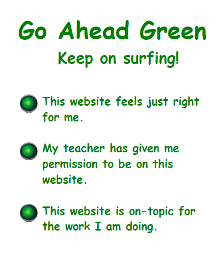
Before Image
|
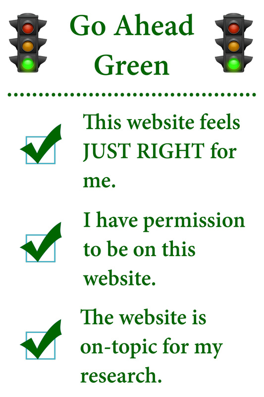
After Image
|
Rationale
"Go Ahead Green" is one of the self-check systems I use for net research in my second grade classroom. The kids understand it and like it...after they get used to it. However, I have never loved the fact that the posters are more lists than checklists. So, I chose this one to remake for visual hierarchy. I added a few small features and changed a few others to draw my students eyes to certain areas of the poster, as well as to let them, and anyone else know, that this is what they are supposed to used to self-check their research websites. It also adds a downward flow to the poster, forcing the eyes to stop and focus on each point individually. It also adds a sense of the top item being most important (which it is in my class) and moving down in relevance. The first thing I was did was to add traffic lights to bookend the title. This serves as a reminder that this goes with our Green, Yellow, Red website check system. I then added a dividing line to separate the title from the content. From this point, I kept the verbiage pretty much the same, however, I did make a small modification to match the language I use in my classroom. Finally, I added check boxes on the left side to serve as a reminder that those are the points I want the students to mentally check off when completing their net research using new websites.
"Go Ahead Green" is one of the self-check systems I use for net research in my second grade classroom. The kids understand it and like it...after they get used to it. However, I have never loved the fact that the posters are more lists than checklists. So, I chose this one to remake for visual hierarchy. I added a few small features and changed a few others to draw my students eyes to certain areas of the poster, as well as to let them, and anyone else know, that this is what they are supposed to used to self-check their research websites. It also adds a downward flow to the poster, forcing the eyes to stop and focus on each point individually. It also adds a sense of the top item being most important (which it is in my class) and moving down in relevance. The first thing I was did was to add traffic lights to bookend the title. This serves as a reminder that this goes with our Green, Yellow, Red website check system. I then added a dividing line to separate the title from the content. From this point, I kept the verbiage pretty much the same, however, I did make a small modification to match the language I use in my classroom. Finally, I added check boxes on the left side to serve as a reminder that those are the points I want the students to mentally check off when completing their net research using new websites.
